Dinse, a prominent law firm based in Burlington, VT, was experiencing an identity dilemma. Their reputation was strong, their firm was growing, and their equity was overwhelmingly positive. However, their visual brand did not represent who they felt they were, or where they wanted to go. Plus, their brand flagship—their website—didn’t serve their marketing goals.
Brand Identity
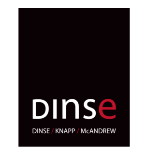
Logo evolution
Web design
Copywriting
Advertising
 Our task was to update their visual identity to have it better represent their values, mission and brand. After our research, it became clear that their approach to work, relationships and internal culture is guided by the philosophy...
That values the humanity of our employees and clients; placing a premium on integrity, compassion and respect in its relationships and work. This set of core values is what drives their efforts towards excellence, and is what allows them to exceed at serving long-term clients with complex needs.
Our task was to update their visual identity to have it better represent their values, mission and brand. After our research, it became clear that their approach to work, relationships and internal culture is guided by the philosophy...
That values the humanity of our employees and clients; placing a premium on integrity, compassion and respect in its relationships and work. This set of core values is what drives their efforts towards excellence, and is what allows them to exceed at serving long-term clients with complex needs.
Original Dinse logo
The logo needed a more proportional place for it to live, giving more emphasis to their name. The harsh red and black needed to be replaced—they are authorities in their fields and work to win, but they are also champions and confidantes for their clients. They needed a calm, authoritative blue, crisp white and lively yellow to reflect this.